Dear reader,
Today I stand metaphorically before you with very literal excitement. Today my great work begins: the wild spewing of my own opinions with the intent of constructive criticism. As stated in my previous post, my plan is to review three Star Trek comics (either as collected volumes, or as individual issues in the case of anthology series), each produced is a different decade, applying to a different branch of the franchise with the goal of eventually compiling the ultimate recommended reading list from 53 years worth of comics.
Star Trek: Gold Key Archives Vol. 1
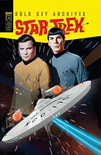 As much as I’d like to say I’m starting with some kind of polished selection beyond what happens to be on my shelf, that would be a lie. And lies are no way to build a foundation of trust. As such, this week brings the first collected edition of Star Trek: Gold Key Archives Vol. 1, written by Dick Wood with art by Nevio Zeccarra and Alberto Giolitti. I’d be lying if I said I wasn’t stoked as hell. The Gold Key books are the first of ANY Star Trek comics plus there’s a personal cherry on top: the kitsch. I LIVE for kitsch.
For those unfamiliar with the word, it’s German in origin so you know it’s packed with layers of judgment. It comes from the German word for “to dangle.” As such, kitsch refers to an opposition to high art: Where some pieces are revered for their loftiness, kitsch is the stuff that dangles below. While it can definitely be used as a term of criticism, I’ve always felt like it has an important place in exploring the relationship between pop culture and pop art. Even if a piece isn’t the preferred set of tastes and techniques de rigueur, a piece still has meaning and a story to tell. I’m such a fan of the concept I put it on my comic grading rubric.
The differentiation between high brow and kitsch isn’t necessarily a negative. I like kitsch because it speaks more to the zeitgeist or the general enthusiasms of the era in which they were produced. A Margaret Keane painting of a big sad-eyed toddler says just as much about 60’s America as Botecelli’s Primavera does about renaissance Italy. And I LOVE that.
And let me tell you, if you love you some kitsch you’re going to really enjoy some stuff in these Gold Key comics. What it lacks in the creative finesse of TOS, it makes up for in the look it gives into both how the people selling Star Trek to a comic audience thought about the appeal of Star Trek to its initial fanbase, and how they thought to apply that with the people they thought of as comic buyers.
Visually, this comic is like hearing a Devo song with your eyes. It doesn’t hurt that the colorist decided that Yeoman Rand’s hair was some kind of tactical Energy Dome. (Which probably wouldn’t have jumped out so much if there had been another named woman character in this book.) As far as Sixties sci-fi art goes, there’s some truly beautiful fantastic scenery. You can really see where this style of work influenced later artists like Dave Gibbons in the more sci-fi heavy parts of Watchmen. And I’m dead serious when I say there’s a few panels that on their own I’d love to see blown up in scale and given the Roy Lichtenstein treatment.
Story-wise, the comics do what they’re intended. They give us self-contained episodic adventures of the Enterprise crew. Or at least characters that look a lot like them and have their skills – characterization doesn’t seem to have been a major priority. But that’s the trade-off for the amount of action, which is where I have to give respect to Dick Wood. If the goal of a Star Trek tie-in comic aimed at kids and die-hard fans is to give the most bang for your buck “stuff-happening” per page, then mission absolutely accomplished. That does mean a distinct level of abruptness, best shown in a final panel where after an asteroid of convicts explodes destroying all life we get an ending note from Kirk of, “Too bad, them’s the breaks.” The End.
In terms of a visually based story, the comics are very location heavy, making really good use of the comics medium in ways that the original series would never have been able to in terms of budget or practical ability. And we get some great “planet of the week”s, like the aforementioned prison asteroid, a planet overrun with city building tech, a planet where plants are the primary life form, a planet with constantly changing landscape where Spock gets haunted by viking scientists. Good stuff, right?
Every now and then, we get to see a little creative prose from Wood slip in with the panel descriptions, which does make me wonder what we would have seen from him had he been working in a capacity where he could have a little more room for that characterization. I’m not going to say that these comics were a mind-blowing revelation in terms of content, and this is definitely your dad’s Star Trek comics. But for what they are they’re a fun piece of creative nostalgia and a glimpse into the kind of creativity the original series inspired.
I rate it 39/90.
Star Trek: The Next Generation: Hive
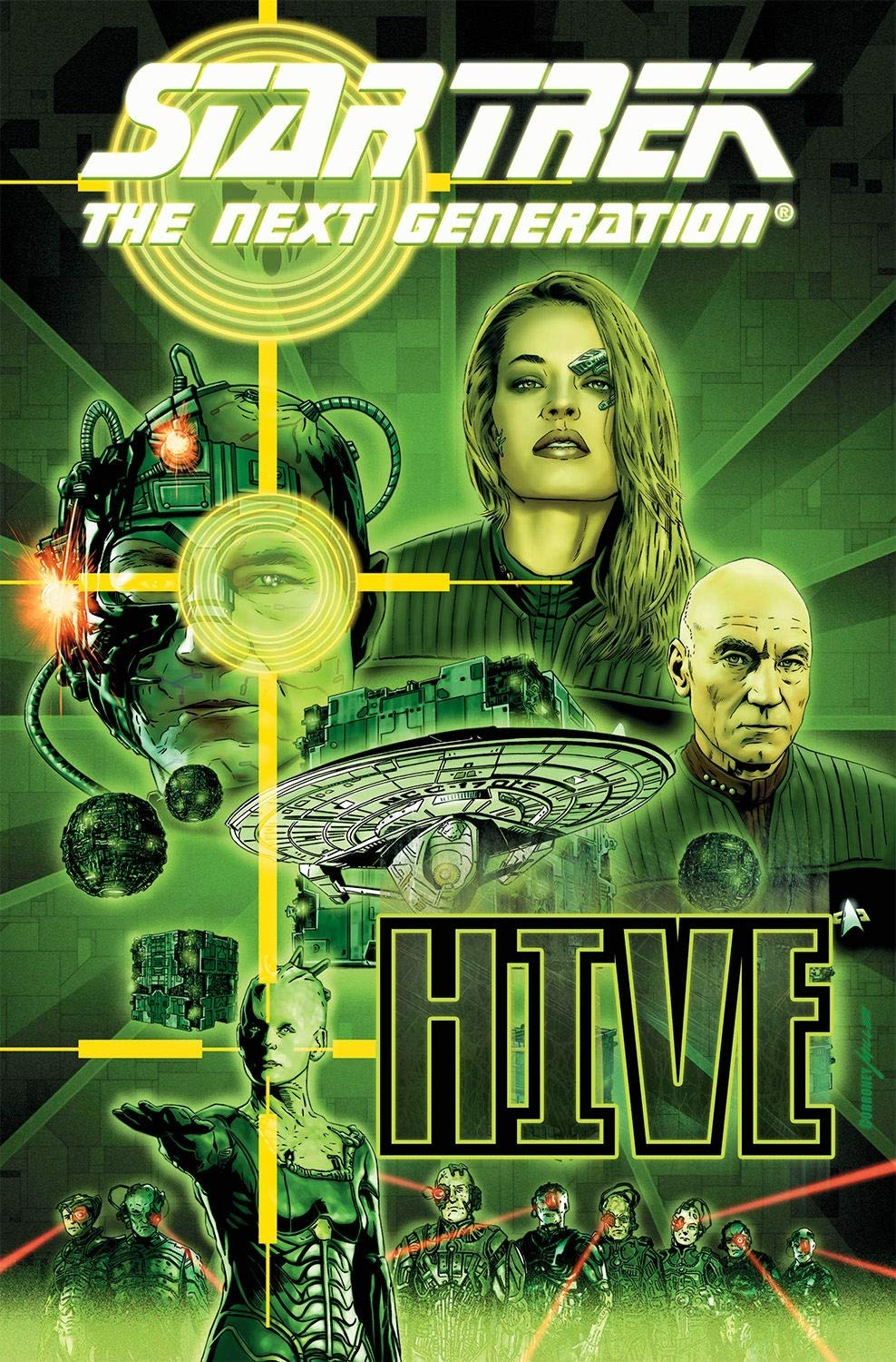 My second comic for this week was the graphic novel Star Trek: The Next Generation: Hive. Script by Terry Matalas and Travis Pickett, story by Brannon Braga art by Joe Corroney. Spoilers ho, natch.
Now full disclosure, I’ve never been wild about what-if stories. They can be interesting in their exploration, but at the end of the day the story’s outcome has no real effect outside of itself. It doesn’t help that. So in any story where what-if is part of the concept, special care needs to be taken in making sure that the stakes still carry meaning. It probably says something that in a book where ships explode every other page, planets fall to the Borg, and a beloved character is killed off that I kept stopping and thinking about the fact that early on in the book, Picard and Vash were getting nasty in the woods. Because that happens.
In simplifying the plot as best I can, I’ve still got a lot to get through so bear with me on this: The plot is set-up to jump back and forth in time, so I’ll do my best to line it up chronologically. The “what-if” of the story starts with Picard, still troubled from his time as Locutus and how special that makes him, recruiting a fresh-out-of-the-Delta-Quadrant Seven of Nine to assist him in taking down the Borg. The plan is to re-assimilate a Borg drone back into the collective with their mind shielded so that they can hear the collective without the collective hearing them. Seven volunteers, because apparently all that character development in Voyager got kinda shrugged off once she reached Earth? Anyhoo, I’m still not totally clear what their long term plan was beyond placing Seven as a double agent, but that doesn’t matter because the Borg speed things up and contact Starfleet a few years later. The Borg Queen herself asks for the help of Starfleet and her dear, dear Locutus, because he is special, in fighting off a newly discovered, bigger, scarier threat than the Borg. Which, after they’ve recalled re-Borged Seven to the Enterprise for her opinion, everyone involved absolutely takes her word on. Once Worf and some Vulcan commandos have what should be a tellingly short confrontation with these newer, bigger baddies, the Borg run Trap.exe, revealing that Picard and Seven’s magical Borg-brain shield didn’t actually work, and causing her to go full-Borg and take over the ship’s computers, while the Borg start taking down a vulnerable Starfleet.
Seven gets better (I guess?) and a Borg Data from the future appears. So in the future, Picard as Locutus has served the Borg Queen for 500 years as King (I guess?) to her Queen. He rebuilds Data from what remains of B4 to help him destroy the Borg Queen once and for all. So Locutus and new funky-fresh Borg Data go to take down the Queen, first quickly dispatching a now half-robo-spider Seven of Nine. The two go on to fight the Borg Queen, who has her own updated look with extra skin and a bikini top (I guess?!?). Data takes out the Queen while telling her Picard is special, but not before she deals Locutus a killing blow. Dying, he gives Data info and directions to a nearby time machine (I GueSs?!) sending him back through to the point when Picard is about to be re-assimilated.
So, up until this point, why Locutus needed 500 years with the Borg, I couldn’t tell you. But apparently he worked out a Borg-destroying virus, so now Picard, Borg Data, and Seven hatch a plan wherein Picard will be re-assimilated but with Seven’s brain-shielding which will actually work this time (I GUESS?!?) and infect the Queen and all remaining Borg. Seven dies while releasing Picard, and as many Borg from the Collective as she can, but makes the time on her deathbed to make sure Picard gets one last pep talk about how dang special he is. (Say it with me now: I GUESS?!) It took me three read-throughs to pare the plot down to just that.
The usual TNG cast does very little, to the point that they feel like set-dressing for a story about how special (shocking, I know) Picard is. The most characterization we get from any of them is when Crusher makes a joke about Picard’s sex appeal seconds after Riker’s announced that Cardassia and Betazed are toast. And honestly, the characterization is a major crux in why the story didn’t work for me. Aside from the obvious example of our Earl-Grey-lovin’ curmudgeon of a caption going to the bone zone in the woods, the only people who really get to act anything like actual characters are Picard and Seven. Seven spends the majority of the story following other people’s orders, and the reader is getting to beat over the head with how special Picard is; it’s like we don’t even know him. Was there an after-credits scene in Nemesis that I missed where he pulls a sword out of a lake and is declared the Galaxy’s most special lad? That combined with the sheer amount of destruction just kind of going on in the background and getting brushed off meant it was hard to feel much of anything while reading it.
I will say I was really struck with the scene in which Seven refuses to detach herself from the Borg Collective in order to release as many drones as she can before the virus takes them out. It spoke towards the empathy and bigger thinking that she developed through her course on Voyager. But then she dies telling him it was all about him and she’s ultimately another prop in Picard’s special-boy adventure.
To his credit, Joe Corroney draws the hell out of a splash page, and his cover artwork is absolutely beautiful, and the space battles are a clear forte of his. Also we get to see Picard wearing a sick Blade Runner looking coat. That said, he does fall into the “reactions/faces not totally matching the context of the scene” pitfall. Especially with women characters. And considering how much Seven this story has that’s… not great.
There was a point where I asked myself if I was thinking too harshly on this story for all of its full-body shots of Seven, but then the comic answered that for me by having a spread of a naked Seven wrapped around Picard to represent her protecting his mind. That was a real “Okay, I’m breaking for lunch” minute for me.
I rate it 19/90.
Malibu Comics “Deep Space Nine”
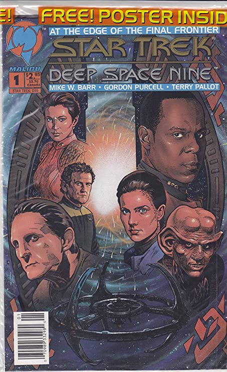 The third comic this week was a set of Deep Space Nine comics, published by the short-live Malibu Comics, written by Mike W. Barr, and illustrated by Gordon Purcell. Try as might, I couldn’t find any title for it beyond “Deep Space Nine”, which makes sense as seems to be fairly early in DS9′s run.
This actually kind of works to its advantage. It’s early enough in the series that there isn’t too much continuity to try and keep up with, and it really does read like a couple of lost episodes of season one with a really good budget. The whole cast is active and in character for their early show arcs, which made for a fun little romp down memory lane for when the series was still finding its feet.
Bashir is still a windbag, Dax is more “sage elder” than “butt-kicking wisecracker.” But now we’re in a medium where Odo can shape-shift as much as the story wants (turning into a hawk to flee his office, and then going back to retrieve his bucket was a great touch) and full use can be made of the entire station as a setting. And it all works! It’s nice look back into both what the initial appeal of the show was starting out, and some creative standalone work.
The likenesses are all there in the artwork, everyone looks like who they’re supposed to be without any of that uncanny “working from promo-pics” look that you sometimes get with tie-in comics. The space of the station is explored and fleshed out with background aliens, just as a busy hub like DS9 should be.
It got me genuinely looking forward to reading more, and honestly kind of kick-started my excitement for this review series. Sometimes you find something that’s its own independent offshoot of a property, sometimes you find a reflection of how people wanted that property to be at the time. And sometimes you find a little something something that fits in as an unexpected addition to something you already really love.
I rate it 40/90.
That Drew Struzan cover on the DS9 one! <3